How to Create a Simple Brand Style Guide for Your Small Business
Do you have trouble keeping your brand image and style consistent? Maybe you find yourself wasting valuable time searching for the right colors, fonts, or images for a simple online post, and each post ends up looking completely different from the last one.
There’s a solution. When your business grows, you’ll easily be able to expand your style guide by adding more documents with details and guidelines.
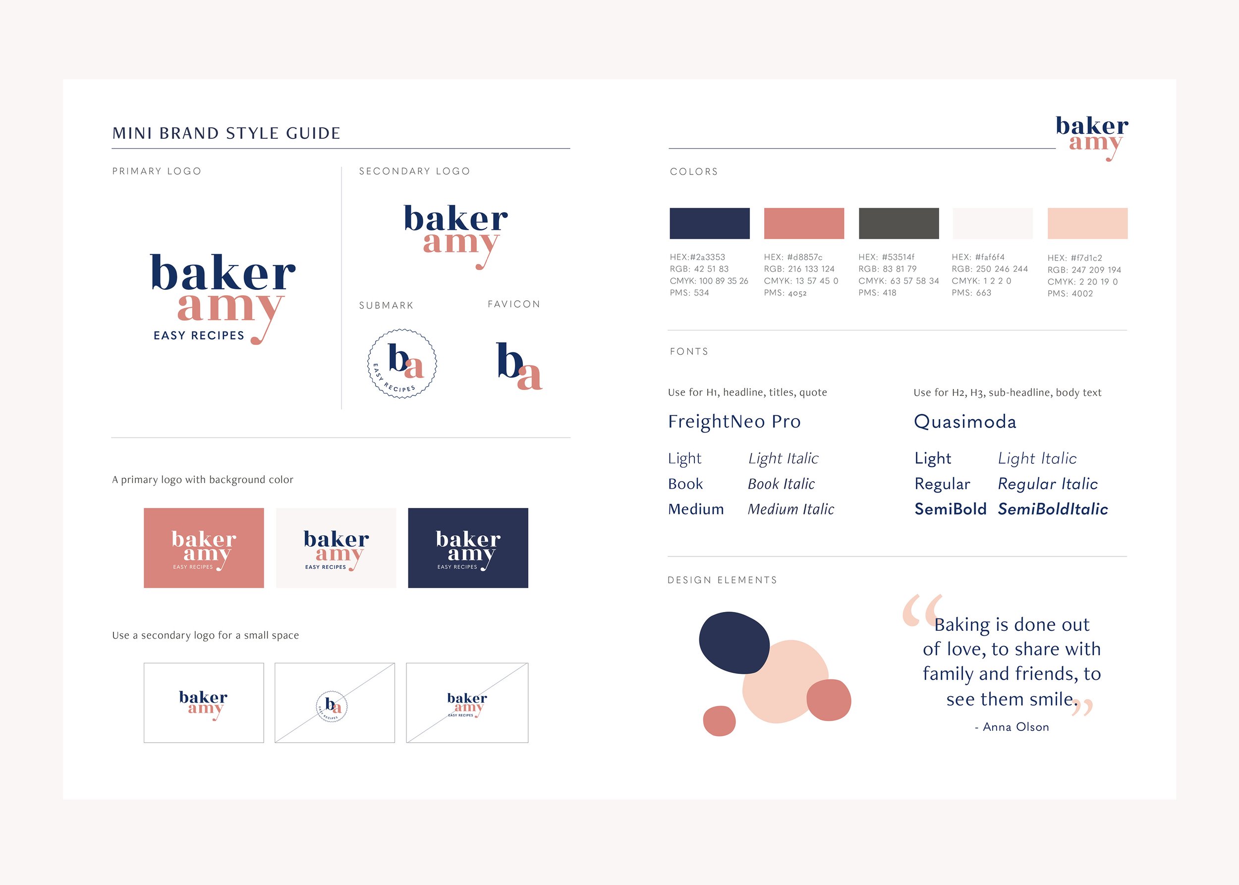
Today, I’m going to share a step-by-step process for creating a one-page simple brand style guide that will help you maintain a consistent brand image and build recognition.
What is a brand style guide?
A brand style guide is a detailed document that defines your brand visuals. It can be as short as one page or as extensive as a full manual—often called brand guidelines or a brand book—depending on your needs.
Your brand style guide includes information such as imagery, fonts, and color selection — and serves as a reference to keep your brand consistent across platforms.
How to Create a Simple Brand Style Guide
Creating a style guide isn’t difficult, but it does require time and attention to detail. I’ll show you how to create a streamlined version focusing on the essentials — perfect for small business owners.
TIP: When you hire a designer, a clear brand style guide makes the process easier and faster—ensuring your visuals stay consistent and aligned with your brand. And as your business grows, your style guide should grow with it too. Do you need a professionally designed brand style guide tailored to your business? Explore my Mini Branding Package to get started with a refined and cohesive foundation.
Step 1: Build Your Brand Foundation
Before you start working on your brand visuals, you need to have a solid understanding of your brand.
This includes:
Your ideal clients
Your brand core ( purpose, vision, mission, values, etc. )
Your brand personality ( voice, tone, etc. )
Your visual style
If you’re not sure about your brand direction yet, my brand clarity workbook can help you gain clarity before you dive into design.
Step 2: Create Your Visual Identity
Include these 4 key elements in your brand style guide:
1. Logo
Your logo is the cornerstone of your brand visuals. Your document should include:
A Primary logo
A Secondary, submark logo and ( or ) favicon
These are derived from your main logo. It’s typically smaller than your logo and is frequently used as a favicon or profile picture. A sub mark logo is particularly useful for companies with long business names.
If space allows, you can add the following to the document:
Minimum size and proper proportions of the logo
Clear instructions of the space needed around the logo
Variations in colors, black & white, and reversed
Images of how you don’t want your logo to be
Over time you may change your logo slightly as many companies do. Make sure to keep the latest logo up-to-date in your style guide.
2. Color palette
Your logo isn’t the only way people will recognize your company. When your colors are used consistently across platforms, your color palette will become associated with your business. That is why your brand colors are an essential part of your brand style guide.
There are several types of color modes commonly used by designers for different purposes.
Using the correct color mode and breakdown of colors is important for brand consistency.
Web color codes: RGB and HEX
Print color codes: CMYK and Pantone (optional)
You can convert color modes here.
Remember to keep your color palette simple by using just 1-2 primary colors along with another 2-3 secondary colors for a simple and clean look.
TIP: Keep your color palette simple for a clean, professional look. Consistent use of colors strengthens brand recognition.
3. Fonts
Fonts are used in conjunction with images, to help create a particular feel for your brand. To maintain brand consistency, it’s important to be consistent with your typography.
Brand fonts are usually selected from two different fonts (serif and sans-serif) along with additional styling and sizing. If space allows, you can add the following to the document:
Font selections and style (capital letters, uppercase letters, or small case)
Alignment (right, left, or centered)
Tracking and kerning ratios to maintain a consistent style when font size changes
Remember to look for fonts that have family font styles when selecting fonts for your brand ( italics, bold, bold italics, light, light italics, etc. ). Font families will give you some flexibility to create different effects while maintaining font consistency.
4. Imagery and graphics
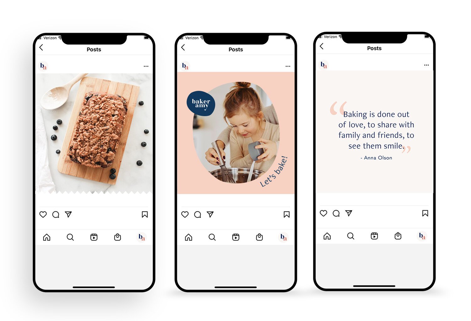
The imagery and graphics that you select should match the feel of your brand. Patterns, photography, and graphics are just as much a reflection of your style and voice as your writing is.
For example, black and white photographs will give you a very different feel than photographs with bright, vibrant colors. Likewise, having white as the primary color with soft lighting gives you a different feel as well. Always remember to keep in mind what you want your ideal clients to feel when they see your imagery.
Also, make sure your imagery works well with your brand’s fonts and colors.
Why a Style Guide Matters
Besides consistency, a brand style guide:
Saves time — no more hunting for past colors, fonts, or logos
Helps designers, marketers, and team members align with your brand faster
Builds trust with your audience through cohesive visuals
Makes your brand more recognizable
If you include 4 key visual elements, you should have a solid overview of your brand style and voice, all on one page. You now have a quick reference guide at hand whenever you create new marketing collateral. You no longer have to rely on your memory for what color or font you used in your last post.
The more you adhere to your brand style guide in the creation of your marketing materials, the easier it will be for your ideal clients to recognize you. When your style and messaging are consistent, your brand becomes more trustworthy to your audience. And the more your audience trusts you, the more likely they are to keep purchasing products and services from your business.
Besides brand consistency, a style guide can be a huge time saver. There’s no backtracking and searching for what was used in the past.
Your one-page brand style guide provides you with a solid starting point with basic guidelines for creating consistent marketing collateral.
Need help?
If you want to save time creating your brand style guide and get professional support, let’s connect!
Explore My Custom Brand Identity Design Services or Get in Touch to book your free branding consultation.


