Case Study: Custom Brand Identity Design for a Preschool
Pamela, the founder of the concept of Golden Rule Schools, reached out to me to help create a custom brand identity design. She wanted to create an overarching supportive website designed to educate interested providers in the philosophy and how-to details of creating a Golden Rule School, and to connect interested families to these schools. Knowing that this website was going to start fast and be long-lasting, creating a timeless logo and brand identity was important to her.
She sent a design inquiry with her completed brand clarity workbook. After reviewing it, I fell in love with the concept of her school. I was eager to help Pamela bring her brand to life and help share her vision with the world.
Brand Story
The first Golden Rule School, Owl House Children’s Sanctuary, was founded in 2005 by early childhood specialist Pamela Plowman. The school, located in beautiful Hailey, Idaho, is surrounded by forests and mountains. Pamela envisioned a preschool with a unique philosophy:
The Golden Rule School is designed to support whole-child wellness—including ideal brain growth and development—for children ages 13 months to kindergarten. The school provides free play in natural surroundings within the boundaries of the Golden Rule, which gives the children a solid foundation to achieve their full physical, social-emotional, and intellectual potential and empower them with the skills to live freely in peace.
“We believe that whole child wellness is achieved through free play in nature and natural surroundings, bounded by the Golden Rule. This is the way children develop personal responsibility and respect for the equality of all.”
- Pamela Plowman, Founder of Golden Rule Schools
Creative Direction
Creating your visual brand identity starts with a well-thought-out strategy—this step is critical for the design process. Pamela had already established a solid foundation and a strong concept for the school. I had an initial discovery call with Pamela and later, we met again to further clarify the brand by simplifying the brand strategy.
How do we simplify the strategy?
Throughout our calls and in the brand clarity workbook, I noticed that she used the same keywords to communicate her vision. Those frequently repeated words become the brand keywords. Once that is established, we can eliminate the other less important items. These calls are an important part of the design process. They allow me to gain a deep understanding of the brand and create a simple logo design and brand identity that is true to my client’s core values and vision.
Brand Look & Feel
In my experience, most business owners enter the design process with a vision in mind and some visual ideas of what they want their logos and brand identity to be like. To help bring these ideas out, I give each client a Pinterest mood board assignment since sometimes it’s hard to describe ideas with words alone. A mood board is a perfect way to express our visual ideas and ensure that we are both heading in a similar direction.
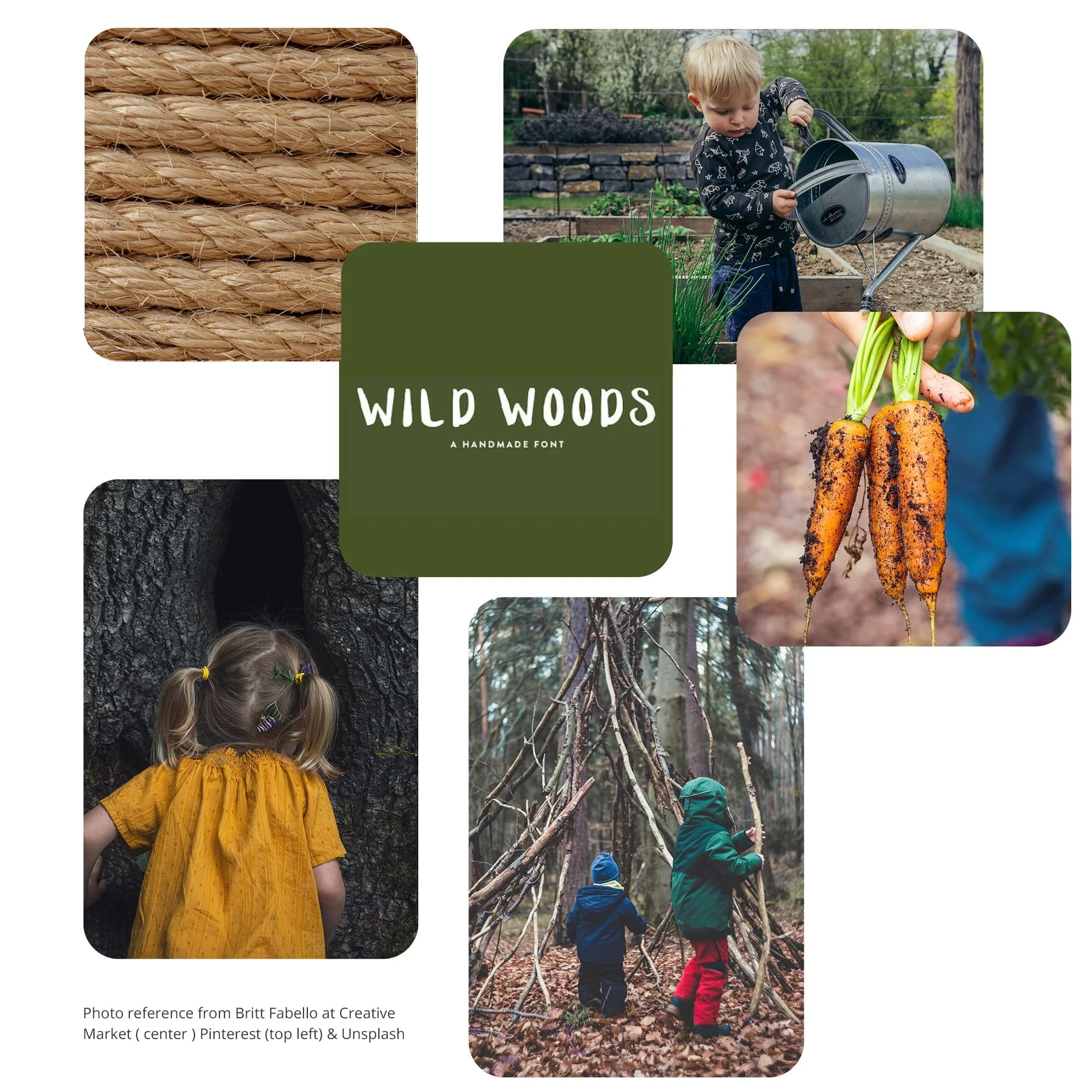
Image source: Wild Woods - A Hand-Lettered Font , Rope, A boy in garden, Carrots, Outdoor, A girl
Pamela created Pinterest boards by collecting images that she thought best represented the look and feel of her brand. When I reviewed her boards, I noticed that her visual ideas tended to be warm, natural, and earthy.
I combined Pamela’s images with my collected images and created a brand mood board that reflected the look and feel of her brand. I showed her two mood boards to choose from. We decided to go with a color palette consisting of warm, natural, and rich earth tones.

Creative Process
Logo Design
Once we established the visual direction and the overall look and feel of her brand, I started creating her logos. I did a lot of sketching of simple logo ideas on paper. To create the visual design elements, I revisited the Golden Rule Schools’ brand concept:
The Golden Rule School uses its kinship with nature to foster children’s wellness by providing free play in natural settings within the boundaries of the Golden Rule.
• I incorporated three key elements into the logo:
Logo design concept: Representing the school vision, thriving children are incorporated with trees symmetrically aligned. Since free play in a natural environment fosters a child’s brain development, a small circle at the center represents a child’s head. No matter what angle you view the logo mark from, it’s always balanced and equal, which reflects how children learn about equality in nature.
• The logo is based on the golden ratio:
A ratio found in nature that is balanced, harmonious, and equal. The Golden Rule School is situated in a natural setting as if the school is a part of nature. The Golden Rule also encourages equality and balance. I used the golden ratio to guide the proportion of the circles.
• The logo is created in freeform shapes:
When you look at the logo carefully, each shape is slightly different, which gives a natural feel.
I presented Pamela with three design options to choose from:
Once she selected her favorite design, I created logo variations including a secondary logo and a brand mark.
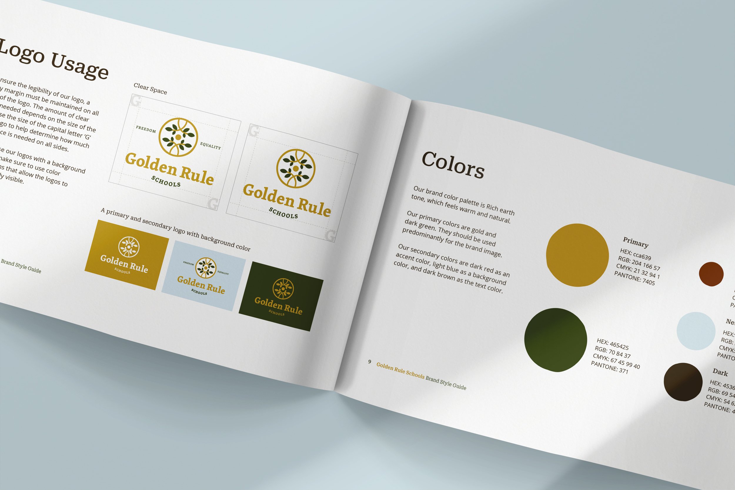
Brand Style Guide
With the simple logo designs completed, what comes next? I started creating the visual elements for the brand identity, such as the color palettes and typography, and I presented Pamela with a brand board (below left). A brand board allows her to instantly see what her overall brand will look like.
With the new custom brand identity design complete, I assembled a 13-page brand style guide (below right). This guide provides easy-to-follow guidelines on how the visual elements (the logo, color palette, imagery, typography, etc.) should be used in print materials and digital platforms to maintain a consistent brand image.
A brand style guide is a fundamental part of a brand’s visual identity. As the business grows, more visual elements can be added to the style guide to keep the brand visuals consistent.

Brand Visual Consistency
Once the brand style guide and all the final files—including logos and patterns—are delivered to Pamela, she and her team can create marketing collateral that will connect with her ideal audience while maintaining a consistent brand visual identity.

Conclusion
It takes time to build a logo and custom brand identity design. My design philosophy for creating a refined and simple design is to first simplify the brand strategy. With a clear foundation serving as my guide, I can create a brand identity design that will stand out among the crowded digital landscape.
When Pamela was creating her mood board, she shared with me one of the quotes that she collected. It was this quote that really gave me a sense of urgency to help bring her brand to life and share her message with the world:
“ If children don’t grow up knowing about nature, and appreciate it, they will not understand it. And if they don’t understand it, they won’t protect it.”
- Sir David Attenborough, English broadcaster, writer, and naturalist
I believe the Golden Rule Schools can change the world for the better.
Are you interested in working together to take your business to the next level with a small business branding package?
To get started, check out my branding services or book a free discovery call to see if we are a good fit to work together.

