How to Make Your Brand Look More Professional

Typically when we first start a business, we put together a brand identity and website to get the small business started. But frequently, as the business grows and we learn more about our brand and clients, we may find that the original brand identity and website don’t feel right anymore. At that point, it may be time to consider revisiting the brand identity to ensure that it aligns with the brand’s personality and makes your brand look professional. A professional visual presence is critical to take your small business to the next level.
When your brand looks more professional, you’ll quickly gain four key advantages:
Your audience will find you more trustworthy
You will be able to increase the prices you charge for your services
You will attract more high-profile clients
You will feel more confident marketing your services
How do you change your brand to give it a more professional feel?
There are various ways to make your brand look more professional. Following are five steps you can take right now to increase the professionalism of your brand identity design.
Get clear on your brand
Before creating your brand visuals, you need to have a thorough understanding of your brand, which requires some thoughtful reflection.
To get started, answer questions such as the following:
Who do you serve?
What problem do you solve for them?
In addition, it’s important to ensure that you’re not trying to sell to everyone (a common mistake for many entrepreneurs). If you are unsure who your ideal clients are or have defined your audience too broadly, your brand identity will be diluted and your ability to grow will be severely limited. Without taking the time to clearly establish who you would like to sell to, the results will be disappointing even if you create a brand that looks more professional.
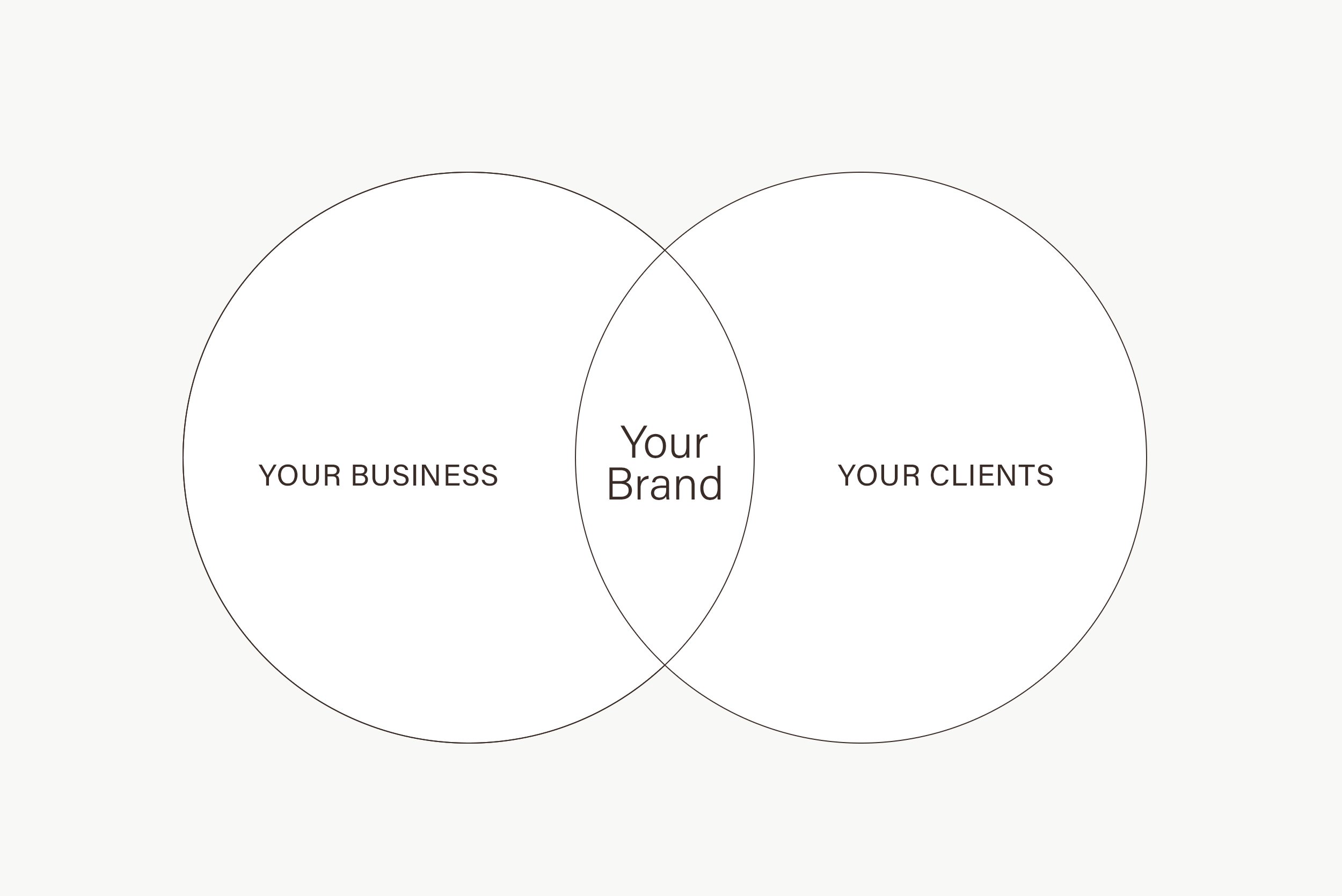
As you can see from the Venn diagram above, your brand is where there is overwrap with your business and your clients/customers. In other words, your brand is the intersection of the products or services you sell, and the clients who need your products.
For example, if you offer premium garden & landscape design services for high-end homeowners, you would want a brand identity design that communicates luxury and elegant.
I want to emphasize that the ideas I am suggesting here, only serve as a starting point to build a complete brand foundation.
For more detailed guidance on how to get clarity on your brand, download my brand clarity workbook for a step-by-step breakdown of the process.
Keep your brand colors minimal
As a graphic designer and branding specialist, I typically use four to five colors at most for a brand color palette. Depending on your designer or brand concept, others may be willing to create huge color palette collections, but my design approach is simple. If you use too many colors, it’s difficult to maintain brand consistency and get your message to stand out. The results will look unprofessional.
I would suggest using five or less colors: 1 main color, 1-2 secondary/accent colors, 1 neutral color, and 1 text color.

You will be using the main color most frequently. I always include text color in the brand style guide. I usually avoid using 100% pure black because pure black text on a white background makes it visually difficult for website visitors to read.
Keep your brand fonts minimal
Using too many different brand fonts for your marketing activities will make your brand appear inconsistent and unprofessional. When I work with design clients, I select only two to three different typefaces.
As a general rule of thumb, using more than three different types of fonts makes a website look cluttered. The various fonts will fight for attention.
Instead, limit your fonts to one or two to create a simple and minimalist design. Remember, you can still achieve plenty of contrast using typefaces with a family of fonts. Use different weights and sizes to enhance text and make the various elements stand out.

Update your brand fonts
Fonts are an essential component of your visual brand identity, but brand fonts can become outdated over time. If your brand fonts look stale, unprofessional, or don’t align with your business, it’s time to update them. To give your logo a refresh, try using a clean and modern typeface.
Which clean and modern typeface is right for your small business depends on several factors: your brand personality, core values, and audience. If the fonts you use reflect your brand personality and core values, they will help to enhance trust and awareness among your audience. If it’s not a good fit, it won’t connect with your audience and it could actually hurt your brand.
Use high-quality photos
Do you use photos taken on your cellphone or camera for your marketing materials or website? I am not totally against using your own photos for your business. These images can give your brand a more personal feel, which helps to create an emotional connection with your audience. However, if you want your brand visual presence to look more professional, I suggest hiring a professional photographer.
But what if you don’t have the budget to hire a professional photographer?
High-quality stock images are affordable and make your brand look professional and trustworthy. According to the data, 55% of brand first impressions are visual. High-quality images attract the interest of potential clients and convey the quality of your services and products. If you take the time to consistently curate superior-quality images for your marketing assets, your clients will think of your brand and products as superior as well.
A key point to keep in mind when you use stock images: Make sure to use images that align with your brand style and personality.

Conclusion
Your brand identity design is important for your business. If your brand looks professional, you will likely attract people who are professional and eager to do business with you. Use the five steps in this post to make your brand more professional: Start by getting clarity on your brand. With that foundation established, you can create a more professional brand identity by minimizing fonts and brand colors. Brand fonts that no longer align with your growing small business can be updated with clear and modern fonts. And finally, make sure that you use high-quality images that enhance your brand identity. Follow these steps to revitalize your brand and take your business to the next level.
I hope this article is helpful.
If you’re looking to upgrade your brand, and would like some professional help from a design expert, please send me a message.


