Spring Color Palette Ideas for Your Brand Personality

Do you feel your energy level soaring when spring arrives? I always feel a renewed energy when spring is here, and we finally emerge from the darkness of winter. With the warmer days, we watch the buds on the plants slowly expand until they burst open to reveal all their light and harmonious colors. Spring also brings the sweet fragrance of freshly cut flowers that fills our homes. Spring is bright, fresh, and warm.
Did you know that you can create a color palette for your brand personality based on the characteristics of spring? To celebrate the spring season, I have put together some spring color palette samples to help inspire you.
Related:
Summer Color Palette Ideas for Your Brand Personality
Autumn Color Palette Ideas for Your Brand Personality
Winter Color Palette Ideas for Your Brand Personality
What is a spring brand personality?
Every brand has a seasonal personality. If you have a spring personality, you are playful, friendly, and energetic. People find you fun and engaging, and you enjoy bringing people together. You’re a great host at a gathering, moving with lightness and ease among your guests. Spring brand colors reflect those attributes; they are bright, cheerful, and warm.
Here are some adjectives to describe a spring personality.
Bright
Optimistic
Youthful
Fresh
Proactive
Creative
Spontaneous
Playful
Warm
Energetic
Approachable
Friendly
Natural
Bright
If you haven't established your brand personality yet, download a copy of my brand clarity workbook. This workbook will help you discover who you are and create a solid brand foundation. Once you identify your brand personality, you can look for the color palette that best aligns with your brand.
How many brand colors should you have?
Generally, essential color palettes consist of five to six fundamental colors. These colors should include primary, secondary, accent, light neutral, and dark text colors. I sometimes work with different small businesses and organizations to create marketing collateral. They frequently provide me with their brand guidelines containing color palettes with a lot of colors. When we receive these large color palettes, we pare them down. We only use a few key colors depending on their brand concepts.
I usually create a minimal color palette. Why? It's easy to use and creates a memorable and impactful brand. Remember, you can always add brand colors as your business grows.
Primary color
Your primary color helps your target audience to identify your brand quickly; it is your brand's main color. Your clients associate your primary color with your brand. The primary color is usually incorporated into your logos, graphics, and signage.
I recommend using no more than two primary colors unless you have a specific reason for doing so. If you use a design with more than two primary colors, your brand identity may look crowded and busy, making it difficult to stand out from the crowd.
Secondary color (accent / complementary colors)
You can use a secondary color alongside your primary color. The secondary color is typically used as an accent color, so it won’t detract from the primary color.
Complementary primary and secondary colors are a powerful way to draw attention to your visuals.
Neutral color
I usually include one neutral color, light gray or beige, but it depends on your brand. Neutral colors are mainly used for backgrounds and footer sections on your website.
Dark color
I usually include one dark text color along with shades of it (using pure black text on a website can cause eye strain). It's a great idea to have dark gray or some other dark color as the text color. This color is also helpful for borders, dividers, or outline design elements.
Spring color palette ideas
Here are five spring color palette ideas for your brand personality.
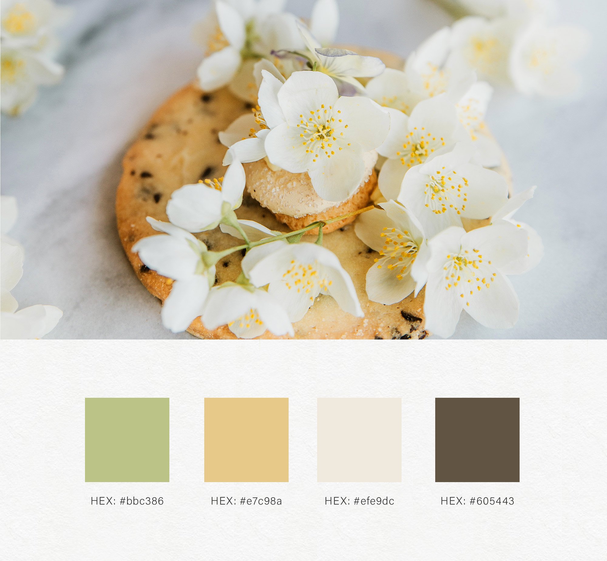
HEX: #bbc386 | #e7c98a | #efe9dc | #605443
HEX: #ed9763 | #ebcf6f | #eee5dc | #7d7a77

HEX: #fdb2c8 | #f8e083 | #efe8e6 | #625757
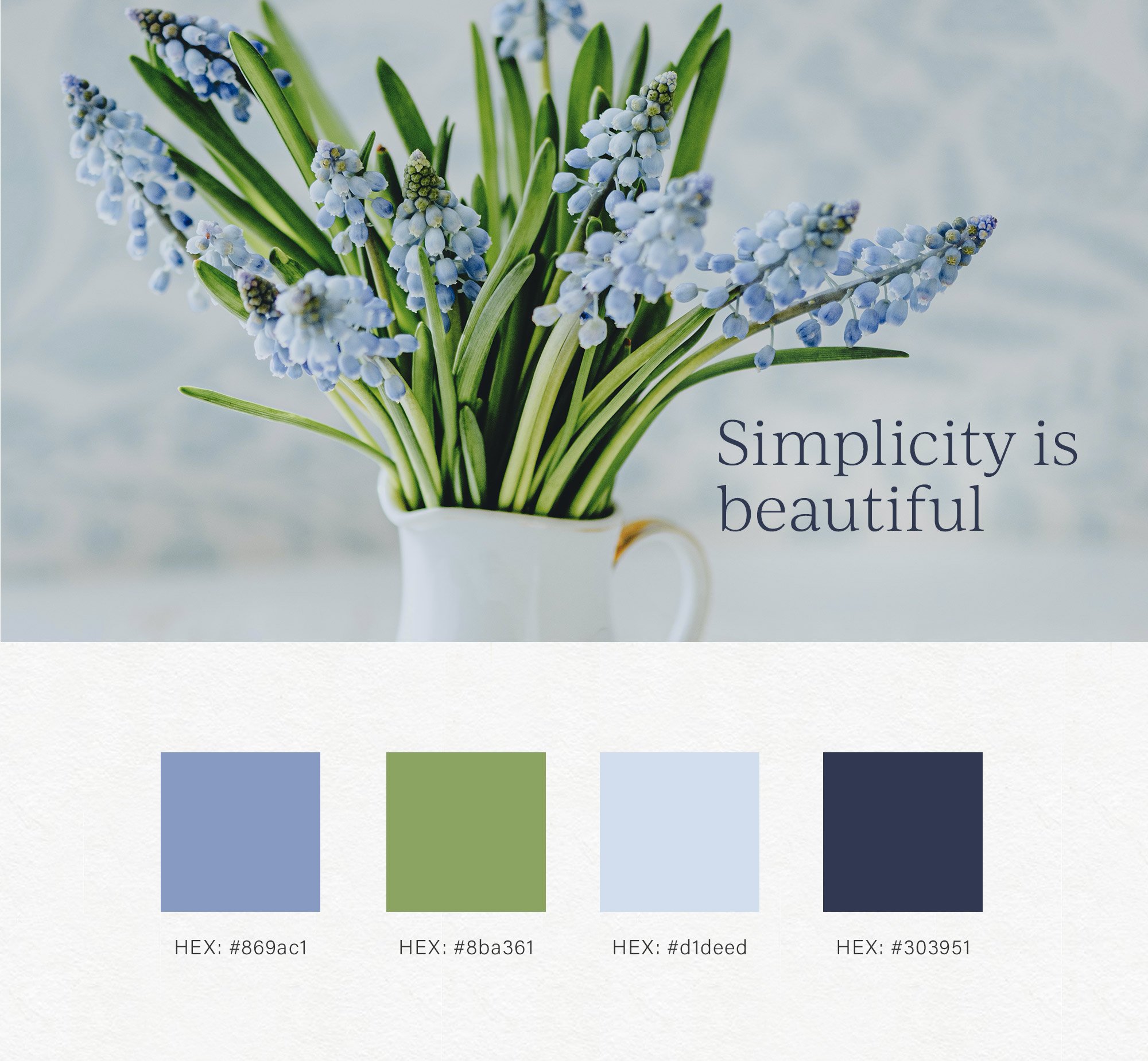
HEX: #869ac1 | #8ba361 | #d1deed | #303951

HEX: #eea98e | #92a05b | #ede2d7 | #8e8380
Conclusion
Brand colors are essential visual elements of your brand identity. To choose the right colors for your brand, you must first establish your brand foundation and identify your brand personality.
Are you a spring personality? If you want to let your clients know that your brand is light, energetic, and fun, a spring color palette may be the best fit for your brand personality. I hope this post helped you get some color inspiration for your brand.
Feel free to save your favorite color palette to Pinterest or share it with your friends who have a spring brand personality.


