Elevate Your Brand: The 10 Best Professional Fonts for Logo Design
Creating a logo that truly represents your brand starts with selecting the right font. Your font is more than just letters on a page — it’s how your small business makes a first impression. The best professional fonts for logo design will feel polished and timeless, setting the tone for your whole brand. Whether you’re looking for a sleek, minimalist design or something with a touch of elegance, the right font can make a difference.
In this post, we’ll cover the 10 best professional fonts that small business owners can use for custom logo designs that resonate with their audience. These fonts not only enhance your brand’s visual identity but also help to elevate your small business and build trust.
You may have already tried using a DIY app for your logo design, only to end up with disappointing results. This post shows how a skilled designer can use typography to transform your brand presence with a professionally crafted logo that aligns with your unique brand identity.
Why choosing the right font matters
A logo isn’t just a design — it’s the visual cornerstone of your brand identity. Your logo design tells your story, reflects your values, and creates an emotional connection with your audience. When I design logos for entrepreneurs and small business owners, I always try to think about what’s most important to my clients. I consider what their brand stands for, who they’re trying to connect with, and what kind of impression they’d like to leave.
Choosing the right font is an important step in creating a logo design that feels true to your business and connects with your audience. When searching for professional logo fonts for businesses, keep these key considerations in mind:
• Your Brand Identity: Your logo design should complement your overall brand identity, including your business values, personality, and visual style. Take a moment to think of the three words that best describe your brand. For example: modern, friendly, or classic.
• Your Audience: Think about your ideal clients. Who are they and what appeals to them? Define their style preferences in three words and ensure that the fonts you select align with your audience’s expectations.
• Consistency Is Key: Ultimately, the fonts you choose for your logo design should pair well with your broader brand style. This ensures a cohesive and professional look across all platforms.
How to choose the best professional fonts for logo designs
Pro-Tip 1: Opt for high-quality sans-serif fonts
If you love clean, minimal logo designs, sans-serif fonts are the way to go. They are modern, uncluttered, and effortlessly stylish. These fonts give your logo a timeless, versatile quality that makes them an ideal choice for various platforms.
Pro-Tip 2: Use only 1-2 fonts
A professional logo is all about simplicity. Limit your font selection to one or two complementary fonts. This ensures that your logo remains distinctive and easy to recognize while maintaining brand consistency. For example, you can set your business name in a serif font and your logo tagline in a sans-serif font.
Pro-Tip 3: Consider a versatile font family
Many professional fonts come in a family with various styles (e.g., regular, bold, italic). When you select a font family, you can maintain a consistent style by using subtle variations in weight and emphasis.
Pro-Tip 4: Make readability a priority
First impressions are important. Your logo fonts should not only look good but also be easy to read. Whether you opt for a sans-serif font for a modern feel or a serif font for a more traditional feel, readability should always come first.
10 best professional fonts for logo design
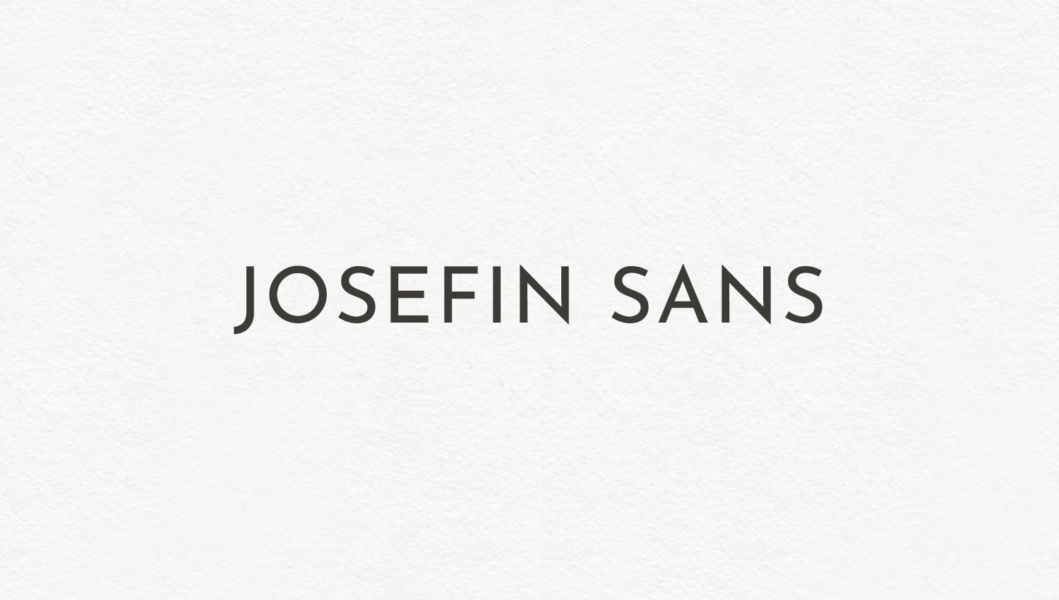
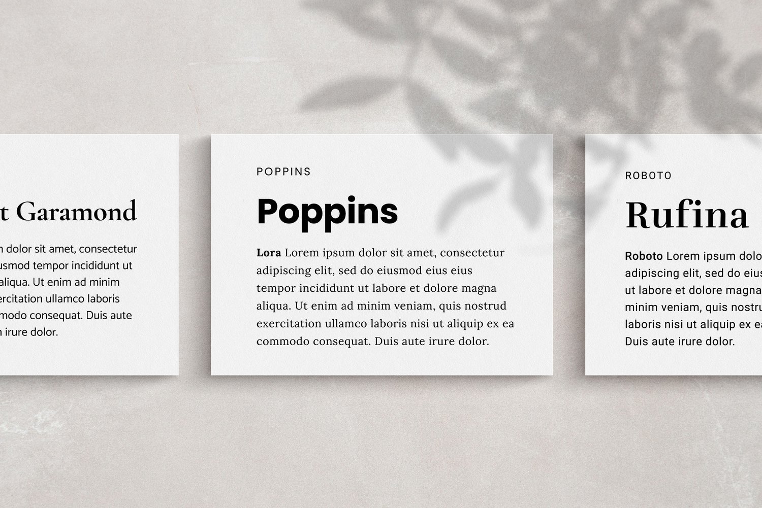
Following are some of the best professional logo fonts that consistently connect with people and get superior results for custom logo designs. Each of these fonts offers a unique blend of sophistication and versatility, making them ideal for a wide range of brand styles.
( Google Fonts / Free for Personal & Commercial Use )
( Commercialtype.com / For Purchase )
( Google Fonts / Free for Personal & Commercial Use )
( Google Fonts / Free for Personal & Commercial Use )
( Google Fonts / Free for Personal & Commercial Use )
( Adobe Fonts / A Creative Cloud subscription or Purchase )
( Adobe Fonts / A Creative Cloud subscription or Purchase )
( Google Fonts / Free for Personal & Commercial Use )
( Adobe Fonts / A Creative Cloud subscription or Purchase )
Partner with a professional designer for custom logo design services
While selecting the right font for your logo design is important, fonts are just one part of the logo design process. Crafting a simple logo design that tells your unique story takes time, creativity, and a clear understanding of your brand. That’s where a professional designer can make a difference.
When we work together, we’ll take a deep dive into what makes your brand unique. I’ll take the insights you share about your brand and create something that’s not just beautiful, but also meaningful — something that feels truly you. Your logo design will meet your unique needs, resonate with your audience, and increase trust.
As a designer, I specialize in timeless logo and brand identity design that help businesses stand out. If you’re ready to elevate your brand with a professionally designed logo, I’d love to help.
Conclusion
Your logo is one of the most important parts of your small business brand — it’s what people remember most. Choosing the right font can transform a good design into something unforgettable. If you want to create a logo that feels authentic, timeless, and professional, let’s talk. Whether you’re starting fresh or looking to refine your current design, I can help you create something that truly represents your business.
Are you ready to create a simple logo design that perfectly aligns with your brand? Book a free discovery call today and let’s get started.


