5 Different Logo Styles: Which is Best for Your Business?
Every day we see different logo styles all around us. Do you see one that you like? Would you like to create a logo with a similar style for your business? You probably already have some logo ideas in mind, such as something simple, but you might want to gather more information since a logo is a very important visual symbol of your business.
When it comes time to design a logo for your business, your mind might start to conjure up the images, colors, and fonts that you think will best fit your brand identity. While these elements are a crucial part of logo design, there’s an important step to consider before that: your logo style.
5 different Logo styles
There are five basic categories of logo styles: Wordmarks, Monograms, Combination marks, Brand marks, and Emblems. In this post, I’ll explain what each style is as well as when you would use it.
1 WORDMARK LOGOS
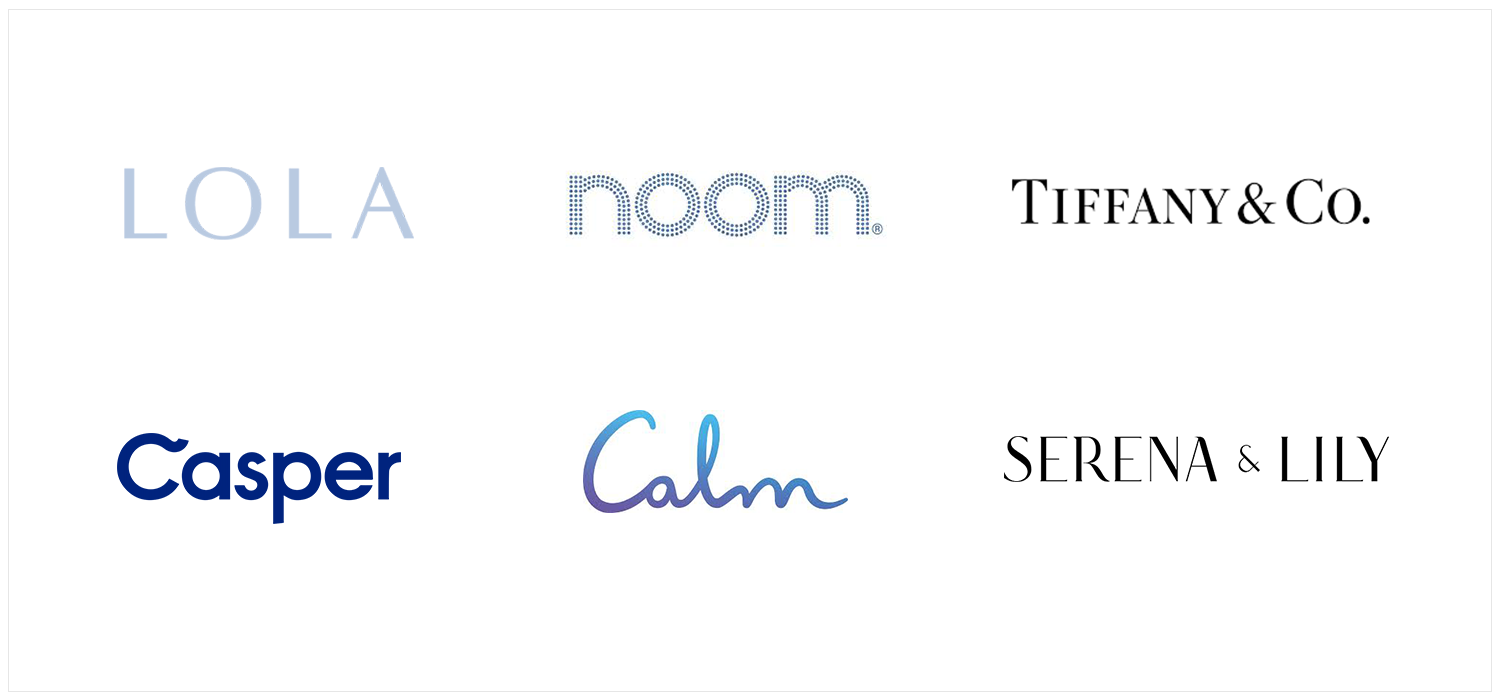
This style is also known as logotype. Wordmark logos consist only of a word. The name of the company is the logo; there is no image to go with it. This style works best for companies with short names. Here are a few examples of clean and simple wordmark logos: Lola, Noom, Casper, Calm, Serena & Lily, and Tiffany & Co. There is still plenty of room for creativity with this logo style: the font, spacing, and color are chosen carefully to reflect the brand personality. Typography is extremely important in this particular logo style.
The benefit of this style is that it can help to build recognition of the company name, so this could be a good choice for a startup. It also helps to convey confidence and stability. Wordmark logos can be used easily across various mediums.
2 MONOGRAM LOGOS
Monogram logos are also known as Lettermark logos. Similar to a Wordmark logo, Monogram logos are only made of text, but typically it’s only the company’s initials or first letter. Some examples include Chanel, Peloton, Mejuri, Fendi, Yves Saint Laurent, V&A.
This type of logo style is helpful when your company name is long or it’s difficult to pronounce. A key advantage is that the shortened version contained in the logo tends to be more memorable for your target audience.
Another benefit of Monogram logos is that they are compact and generally look good in small spaces. This is particularly important in many online platforms, such as social media profile images and website favicons.
3 COMBINATION LOGOS
This type is the most commonly used of the five logo styles. It consists of both an image and text. Some examples you may be familiar with include: Simple, airbnb, Juice Beauty, Pursuant Health, Tula, and BP.
One of the key advantages of a combination logo is that it gives the company a lot of flexibility. If space is an issue, the company can choose to use just the image or just the text and their audience would still easily recognize the brand. The symbol can appear above, below, next to, or inside the text.
The combination logo is a great choice for start-up businesses since it helps to develop their brand identity. As the company grows and name recognition becomes more well-established, the company can consider simplifying the logo by dropping the text and allowing the symbol to stand alone.
4 BRANDMARK LOGOS
Brand mark logos consist solely of a symbol or a standalone image to represent the company. The company name is not included. Some examples of brandmark logos include Twitter, Starbucks, Apple, Nike, Playboy, and MSN.
There are several advantages of this logo style. Brand mark logos have a greater psychological impact on the target audience. People are also more likely to remember images better than they can remember text. Brand marks are also easy to use across multiple platforms and are simple to resize. Well-established Brand mark logos can have a universal appeal across cultures as well. This is a helpful feature for companies that are planning on expanding into international markets.
However, this logo style is not without risk. People need to easily understand the meaning of the image to make a connection with the brand. That is why this style is typically only used by well-established brands.
5 EMBLEM LOGOS
Emblem logos consist of both text and a shape or image, however, the main difference from the other logo styles is that the text is inside the shape. The best way to picture these types of logos is to think of badges, crests, or seals. Some popular emblem logos you may be familiar with include the Ikea logo, Toms, Warner Bros, Design Within Reach, Talk Space, and UPS.
The main advantage of an emblem logo is that it is often associated with prestige and authority. They tend to be identified with brands that have a long history.
The main drawback is that they are generally less versatile than the other logo styles. For example, shrinking an emblem logo for social media or business cards can prove tricky. If the focus of your business is online, this logo style may not be a good choice.
Conclusion
Being aware of these five different logo styles should help you to get started with developing a visual brand identity. Once you have a clear idea of the style you’d like to use, you can then roll up your sleeves and get to work on choosing a logo color scheme, font, and images to create the visual identity that will best represent your brand.
Remember, your logo will live both digitally and physically. If you have an online business, it’s important to have a logo that is simple, easy-to-read, and memorable, as it will be used across multiple digital channels. Your logo will ultimately be scaled to different sizes for different uses.
If your company has a long name, it won’t always fit in small spaces such as a square profile photo. In this situation, a monogram or symbol- only version can make your design more adaptable.
Whatever logo style you choose, your design should leave a strong impression on your audience. Your logo should help your brand to stand out from competitors as well as make it easier to differentiate your product or service. If you take the time upfront to choose the right logo style for your brand, your logo will be a tremendous asset for your company's growth and prosperity for years to come.
I hope this post was helpful. If you have any thoughts, please leave a comment below.


