Easy to read fonts: 10 best clean fonts for your website

What comes to mind when someone mentions that a website is simple and clean? Maybe you think of carefully curated images or colors that are paired well. These elements are important for your website, but there is one essential element that is frequently overlooked: your brand fonts. The typography used to create a professional-looking website helps to enhance your brand’s position in your client’s minds.
It’s essential that the fonts you use for your brand support your brand message. Minimal style typefaces create a professional, modern look for your business. Besides aesthetics, your brand fonts have another crucial role: readability. Simple fonts have clean lines and wide enough spacing that allows the reader to peruse the material easily. Businesses also have to keep in mind that readers are visiting their website from a variety of devices. One visitor may be browsing your site from an old desktop computer with low screen resolution. Another may be viewing it on a higher resolution screen of the latest iphone. Ideally, you’d want your font to look just as good on both devices. You don’t want people to leave your site because they had trouble reading the font.
As a graphic designer specializing in creating simple and clean websites for business, I’ve accumulated a list of “go-to” fonts that I frequently use in my work. Here are the 10 best clean fonts for a website.
Free fonts
This is a sans serif typeface that was inspired by the “classical grotesques”. Classical grotesques, recognized by their simple letterforms and fairly even stroke weights, are called “grotesque” because they were considered fairly crude back in the early 1800s in comparison to the many ornate fonts of that time. HK Grotesk has a more friendly style and is suitable for small text.
A clean, rounded typeface that is both modern and somewhat friendly. It is not quite as easy to read as fonts such as Helvetica, so it’s better suited for larger text such as headings.
Open sans is known as a humanist type sans serif typeface. Humanist fonts tend to look as if they were created by hand. Open sans is an elegant and modern font that’s easy to read, making it an ideal choice for small text on screens.
Montserrat is a geometric, sans serif typeface influenced by the urban signs in the historical Buenos Aires neighborhood of Montserrat. It is often considered a close free alternative to Gotham and Proxima Nova.
Source Sans was specifically designed as a typeface for digital devices. It’s clean, timeless style makes it an ideal choice for text to be viewed on devices.

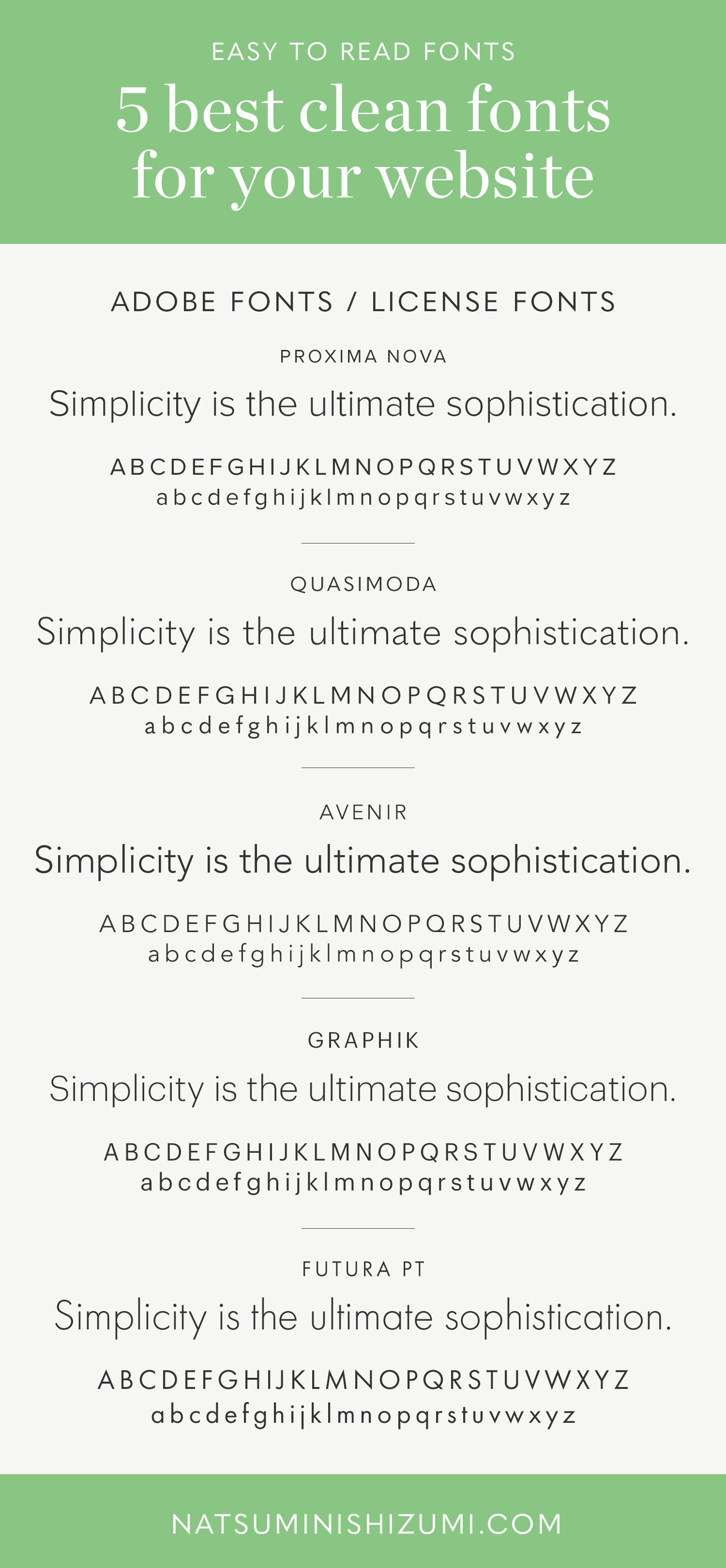
Adobe fonts / License fonts
Proxima Nova, a clean, minimalist font, is well known for its versatility. The design offers various weights and widths and it works well at different screen resolutions. It’s a modern font that doesn’t draw attention to itself. Some have suggested it might be the next Helvetica.
Quasimoda is a sans serif font with various weights and italics. It’s a blending of the modern geometric form with some classical proportions that makes it quite a versatile font.
Avenir is a sans serif font influenced by geometric styles. The designer of the font drew on inspiration from another font called Futura. The word Avenir is a French word meaning “future”. The changes incorporated in the design made it easier-to-read and is well suited to both headlines and text.
Graphik is a typeface that was never intended to be available to the public. The designer, who was influenced by Swiss Modernism, created the font for his own use on invoices and PDFs to clients. When clients kept asking about the font, he decided to make it commercially available. It has been described as a “vanilla-style” font, well suited for nearly any design need.
Futura PT is a sans serif font based on the geometric style. It is offered in a wide range of weights and widths making it a great choice to use as either text or headlines.
There is one sans serif font that I would suggest avoiding if you are trying to create a brand image that is clean and elegant: Lato. I normally use light-weight fonts in body text. Lato has a variety of font families but the lightweight version is too thin and it’s hard to read. The regular weight is too thick. There is no version with just the right weight. That is why it is so important to choose a brand font carefully. When you create a website, you may need to update your brand font or add a similar font to use for your site.
There are thousands of fonts to choose from. Here are a few resources for selecting clean fonts for your website:
https://creativemarket.com/fonts
https://www.creativebloq.com/tag/typography
Need design help? Or is this time to refresh your brand? Please send me an email. Let’s chat.