4 Tips for Engaging Your Target Audience with Typography
When you visit a website and the text is hard to read, what do you do? Do you continue to read or stop reading and leave the site? What if this same situation happened on your website? What if your content is hard to read and your message doesn’t resonate with your audience? Your site visitors may leave your site without taking any action. If you use your typographic elements carefully, your site will be much more comfortable to read and engaging for your target audience.
Here are 4 typography tips:
FONT SELECTION
Choose the right fonts to connect with your audience
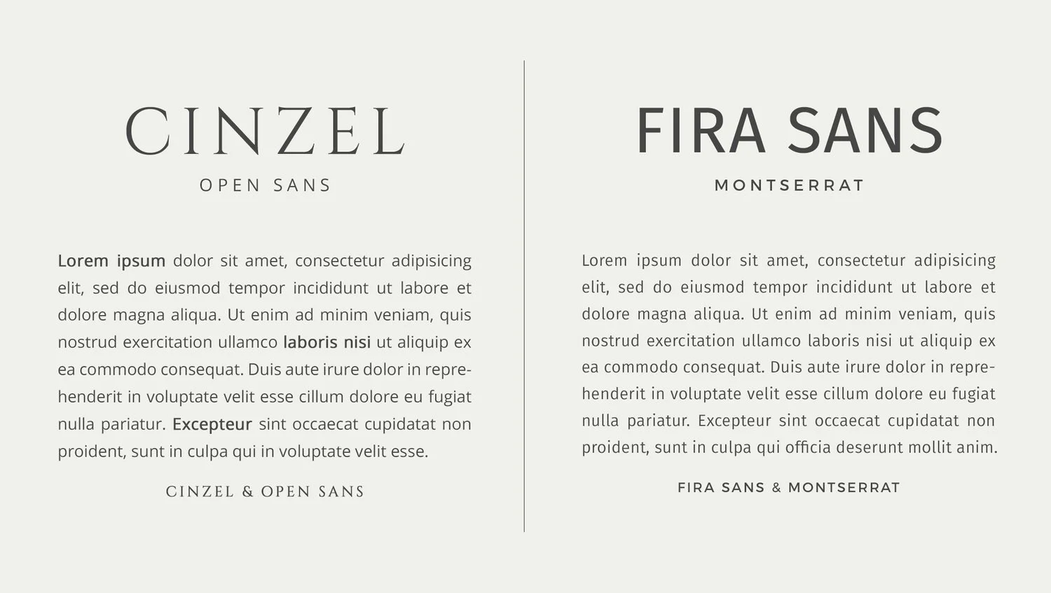
There are so many typefaces to choose from and it’s hard to choose the right ones. Each typeface has a style and personality that should reflect your brand and create a deep connection with your audience. I normally use 2-3 typefaces as brand fonts. One is a serif typeface and the other one (or two) is a sans-serif typeface. Or like the example below, I use the same sans-serif typefaces but with a different style and shape that pairs nicely.
Serif font: A serif font is a small line attached to the end of a stroke in a letter or symbol. Popular serif typefaces include Times New Roman and Courier. Cinzel ( below left ) is also a serif font.
Sans-serif font: A sans-serif font has no line attached to the end of a stroke in a letter or symbol. Popular sans-serif typefaces include Helvetica and Arial. Fira Sands, Open Sands and Montserrat ( below left and right ) are also sans-serif fonts.
Here is another example. I wouldn’t use a playful and cartoonish font (left) to create a luxury brand style. Instead, I would use a typeface that is modern and elegant (right).
In addition to the style of the typeface, the font needs to be readable. It’s better to avoid using italic fonts as a primary font. Also, choose a font that is easy-to-read for your headline copy so that your message stands out better.
TYPOGRAPHIC HIERARCHY
Use a visual hierarchy for quick scanning of your content
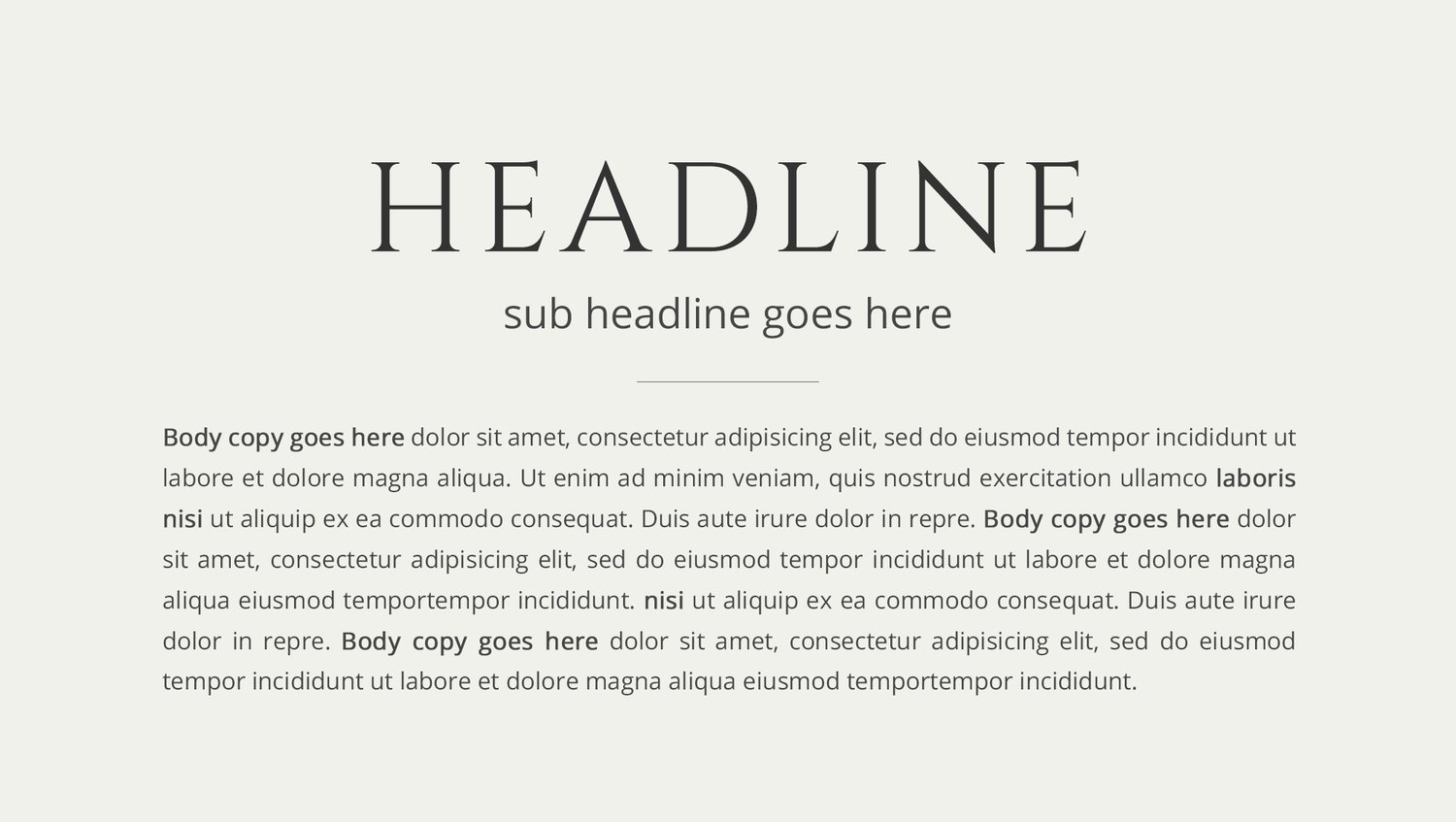
Typographic hierarchy is the visual order of the text on a page. The headline (the title) is more prominent than the secondary headline (the sub-title). The sub-title in turn, is more prominent than the body text (the main content of the page). Using different typefaces, font sizes, and colors will help the reader distinguish which part of the message is most important and should be read first.
For example, if you want to promote a sale for your product, you want to emphasize the text “30% off”, “last chance”, or “sale ends today” to engage your audience. If you don’t use a visual hierarchy, your target audience may not notice your offer.
LINE SPACING
Use vertical spacing to make your words easier to read
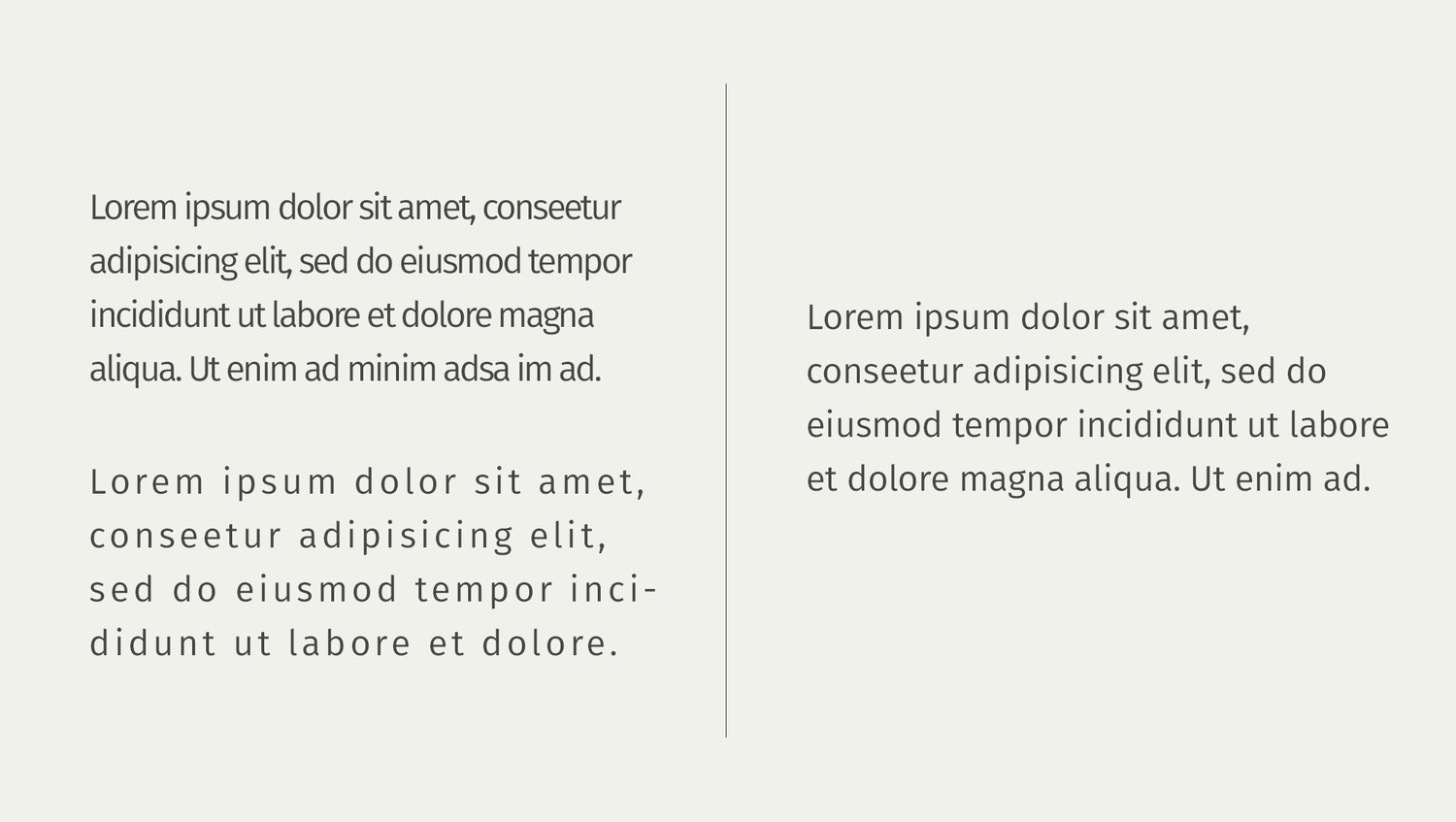
Vertical spacing, commonly referred to as line height, is the white space between lines of text. This plays an important role in the readability of the text. If the line spacing is too tight, the reader will have to work to keep their eyes tracking the correct line. If the line spacing is too far apart, the lines will appear disjointed and unrelated. The ideal setting allows the reader to easily follow the line of text to the end, which flows smoothly to the beginning of the next line.
Another consideration with vertical spacing is the space between paragraphs. White space is essential to give your reader’s eyes a welcome rest. Readers can quickly become overwhelmed when they see large blocks of text without breaks.
LETTER SPACING
Adjust spacing between letters and words to make them easier to read
Likewise, letter spacing also affects the readability of a website. Letter spacing is, as the name suggests, the space between each of the letters in a word. Allowing enough space between the letters will create a page that is both open and inviting for your readers.
Word spacing is essential to create inviting, easy-to-read copy. This small detail can play an important role in establishing the color, texture, and readability of your content. When the words are too close together, the words can appear as though they are running into each other, making it very difficult for your target audience to read. However, a much more common occurrence is word spacing that is too open. This creates large blocks of white space between words, forcing the reader to slow down and read each individual word rather than the more preferable blocks of words. This can cause the reader to lose interest as well as hinder their comprehension.
When you need to update the content on your website or even in your marketing materials, please keep these tips in mind to create content that engages your audience.


