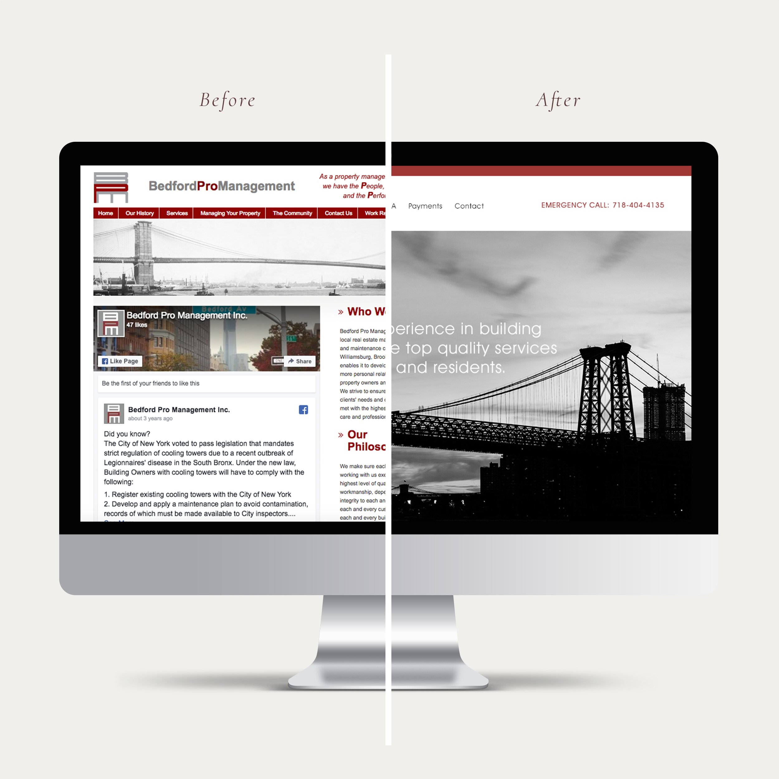
A Case Study of a Property Management Website
The homepage is the first page you get to when you visit a website, so it's very important. It’s not just about writing some words and placing some images on your site. It needs to be functional and easy for site visitors to navigate and find what they need. Here’s what we did to improve their homepage.
1. Added an emergency contact
Problem: They offer an emergency service for their customers but there was no contact information for it on the homepage.
Solution: When people are dealing with home emergencies such as home flooding or plumbing issues, people rather talk to a person on the phone rather than filling out a form. So, we added "emergency contact with phone numbers" to the top right corner, so it's easier for site visitors to find and contact them.
2. Added a headline copy over the large image
Problem: There was no headline copy or image but there was text all over the page, so it was hard to know what to focus on and read.
Solution: We added a headline over the large image. Site visitors can now quickly understand what Bedford Pro Management does and whom they help. It’s also an eye-catching visual for the site.
3. Added call to action buttons to navigate site visitors what they need
Problem: There was a Facebook feed in the middle of the homepage that hadn't been updated for a while.
Solution: We thought Facebook feed was less important, so we moved it to the bottom of the page. We also created a button in the box for each of their service offerings: package, repairs/maintenance, and online payment. Now it’s easy for site visitors to navigate what they need.
4. Added customer testimonials
Problem: There were no testimonials on the site.
Solution: We added a few testimonials on the homepage, so people can see them easily. Testimonials from happy clients are one of the best ways to build their credibility and to show potential clients that they are trustworthy and an expert in their field.
We don’t just make things look pretty. We focus on the target audience, the design problem, the business goals and so on…
Do you have any design problems? Please feel free to contact me at info@natsuminishizumi.com for a free 30 minute design consultation.


